Lead Developer: "I worked with Charlie Sparks on redesigning my Drinking App, Drink To That. Originally, I only came to him for a logo and banner, but after seeing some concepts for how the game could look, I instantly knew that I had to keep working with him. With constant communication, he was able to deliver creative and easy-to-interpret detailed designs that made the app look 100x better whilst also suggesting some new features. I will definitely be messaging him in the future for other work."
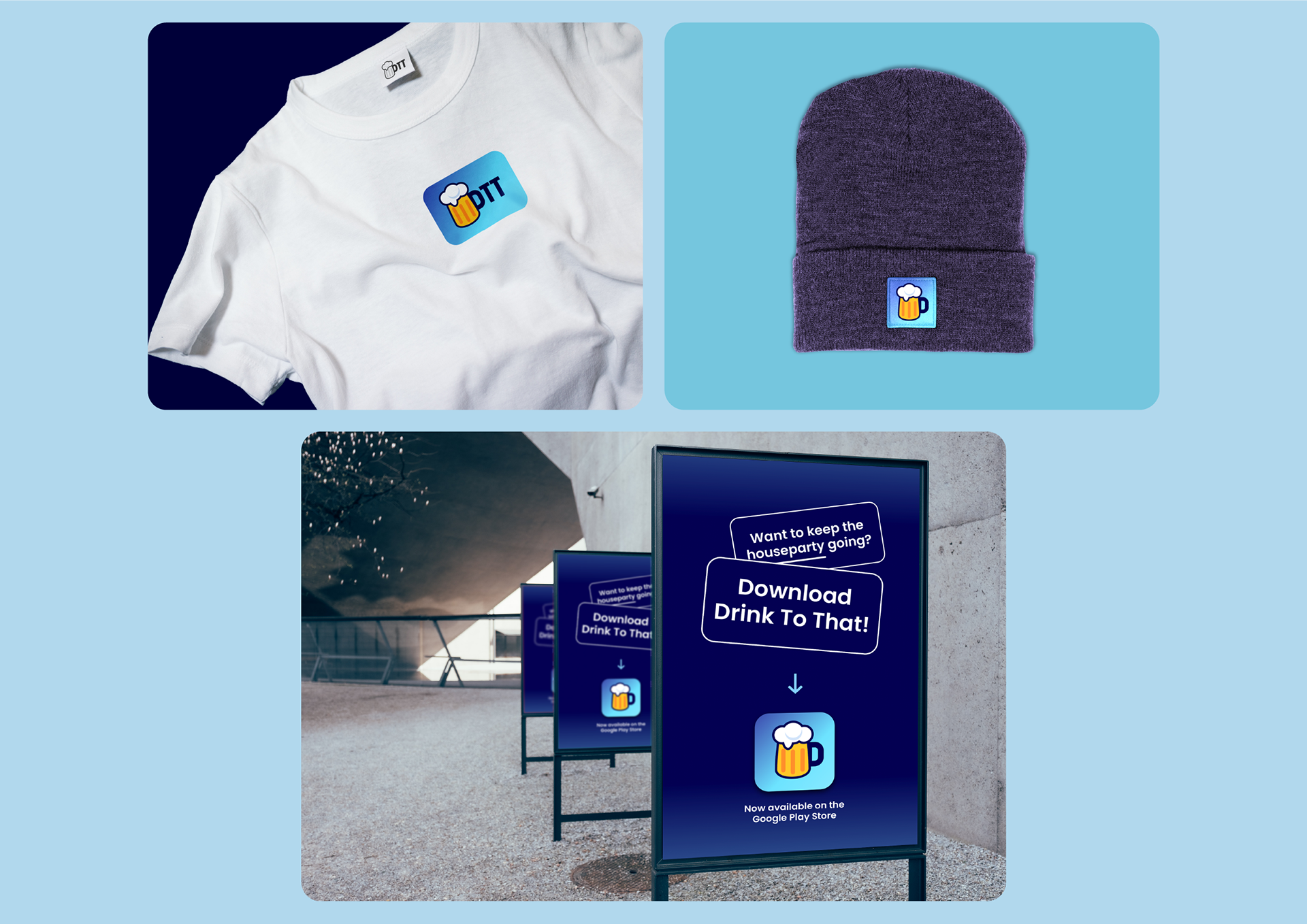
A drinking game app that aims to offer a fresh take on the genre, giving more power to the user with custom rules and features. I was brought onto the project rebrand the app (logo), overhaul the app UI and design new gameplay features. My primary aim was to design a user interface that is vibrant and easy to follow, catering to a user-base commonly playing under the influence of alcohol.
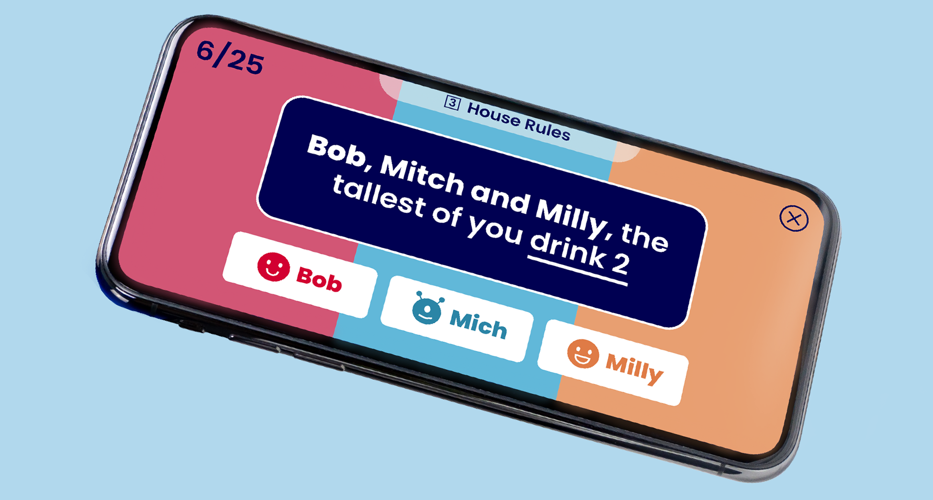
The primary game mode features a series of prompts and questions for the player. My focus was to create an experience that engages the user and allows them to easily follow the on-screen prompts. Each player is assigned a colour and icon, which will be displayed onscreen whenever that player is required to participate. Accompanied by bold text, this design direction makes it easy for the player to keep track of the game, and helps organise a busy room with a simple glance.

All screens in the app have been designed to have clear buttons, and large readable legible text. Colours work to let the player know when to participate in a task, with underline text used to quickly identify the task forfeit.
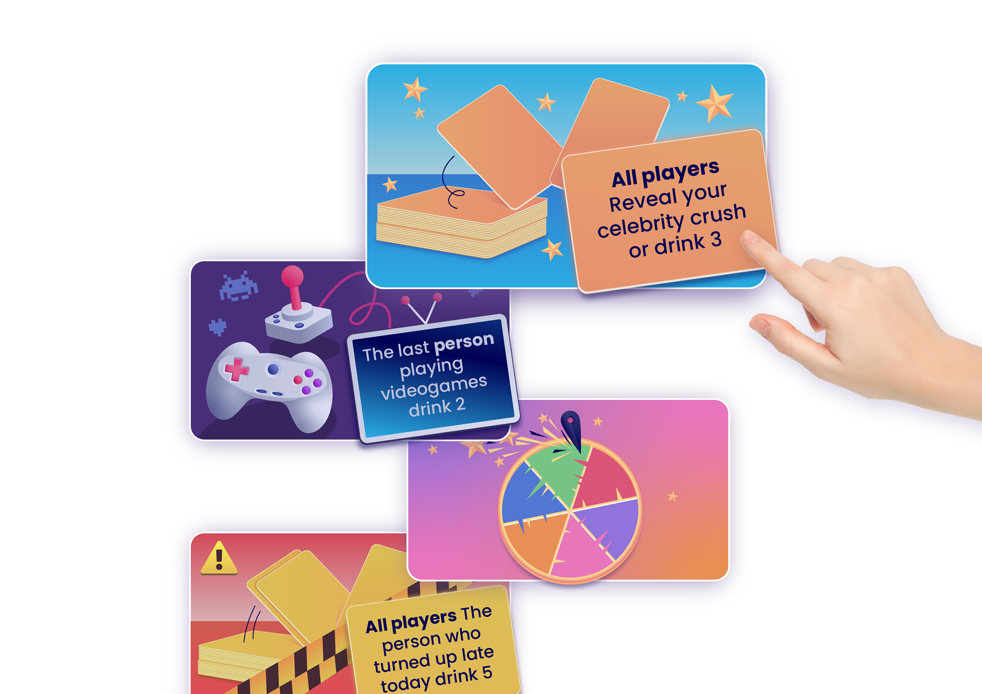
Each game mode is accompanied by bright artwork. I designed each to be eye catching, but also to communicate the types of questions the game mode features. One game mode for example features questions all about video games, while another features higher drink quantities.